CLIENT
CLIENT
SLATE
SLATE
DISCIPLINE
DISCIPLINE
Visual Identity
Visual Identity
Strategy, Packaging, Visual identity
CHALLENGE
CHALLENGE
SLATE builds bespoke creative teams for projects big and small using a network of talented specialists. The name refers directly to the team slated for projects, and also the idea of new beginnings.
The idea for SLATE is to build bespoke teams for projects big and small using a network of talented specialists. The name refers directly to the team slated for projects, and also the idea of new beginnings.
The idea for SLATE is to build bespoke teams for projects big and small using a network of talented specialists. The name refers directly to the team slated for projects, and also the idea of new beginnings.
The idea for SLATE is to build bespoke teams for projects big and small using a network of talented specialists. The name refers directly to the team slated for projects, and also the idea of new beginnings.
Launched in 2008, Kick-Start brand had been a successful venture, but the brand was losing steam and needed an addrenaline boost.
SOLUTION
SOLUTION
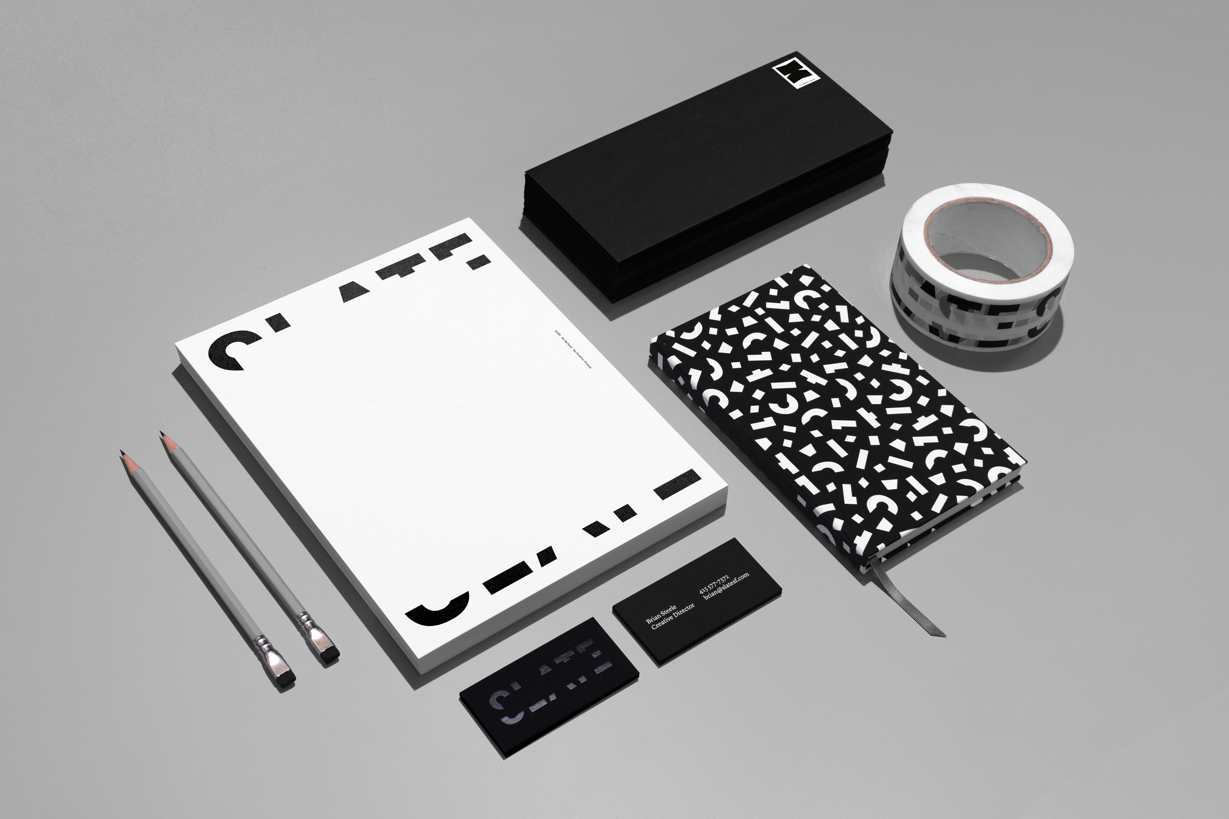
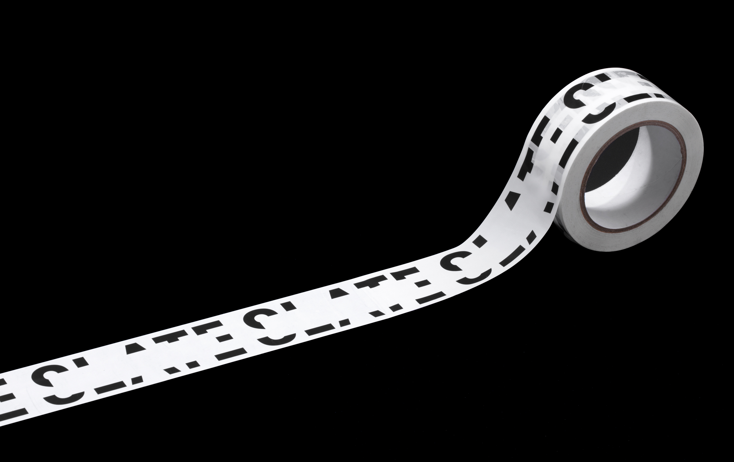
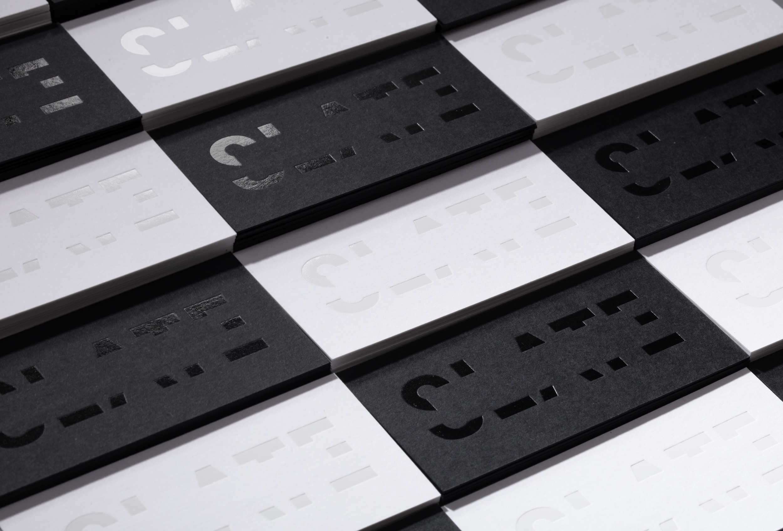
The swipe through the letters infers a “clean slate”, and is also a framing device. Although a large portion of the logo is removed, it is still clearly readable – representative of a studio model that makes an effort to do more with less, and a creative philosophy to strip away the unnecessary and leave the unmistakable.
Even though the logotype is bold, it still feels discreet when it needs to be, to let the work of the studio shine. The swipe across the letters infers a "clean slate" and is also a framing device. Athough a large part of the logo is removed, the logotype is clearly readable – representative of a studio model that removes unnecessary elements.
Even though the logotype is bold, it still feels discreet when it needs to be, to let the work of the studio shine. The swipe across the letters infers a "clean slate" and is also a framing device. Athough a large part of the logo is removed, the logotype is clearly readable – representative of a studio model that removes unnecessary elements.
Even though the logotype is bold, it still feels discreet when it needs to be, to let the work of the studio shine. The swipe across the letters infers a "clean slate" and is also a framing device. Athough a large part of the logo is removed, the logotype is clearly readable – representative of a studio model that removes unnecessary elements.
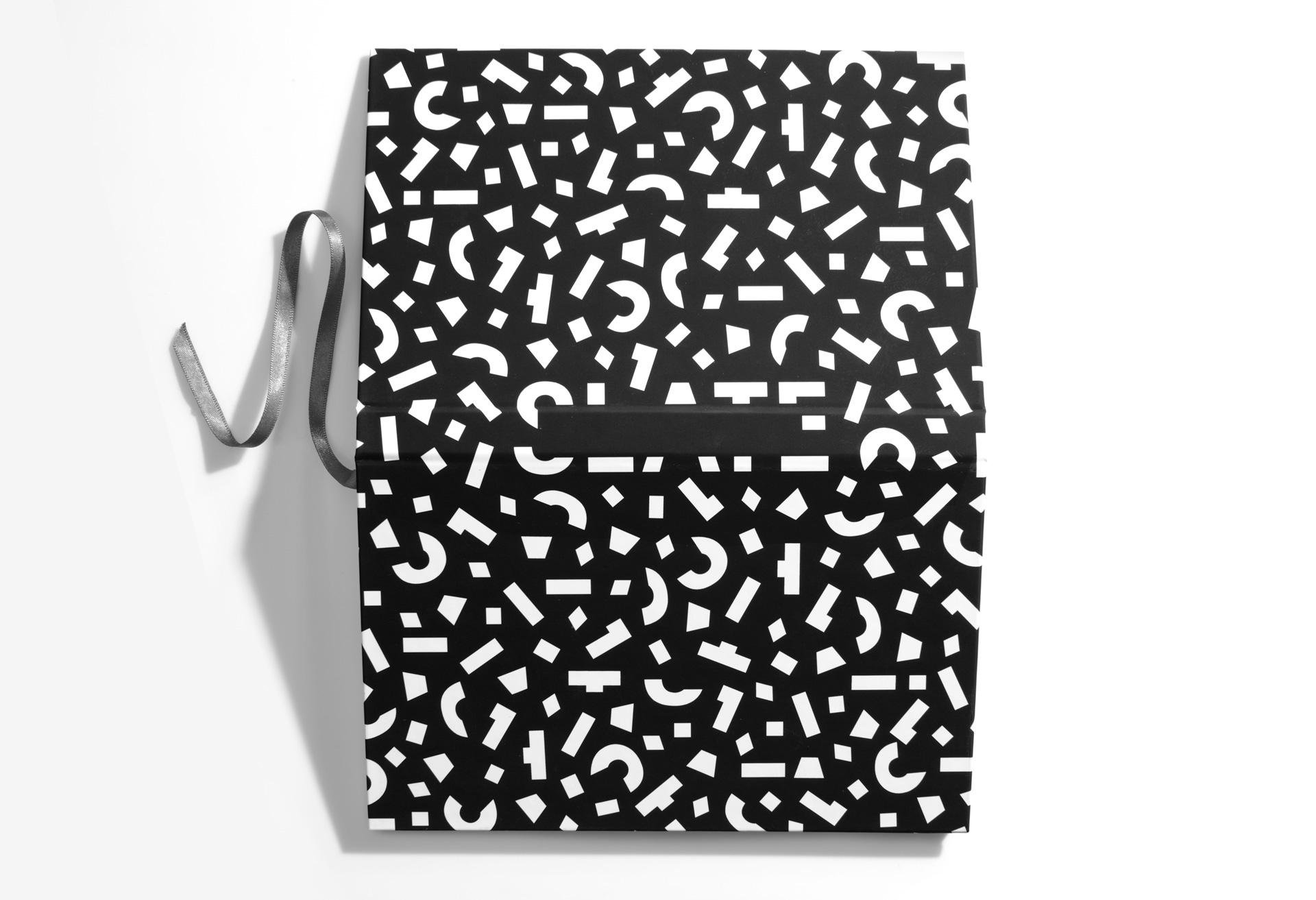
Bring updated logo to life through a refreshed and targeted packaging design system. Celebrate the brands core character attributes: rebelliousness, innovation, and wit.