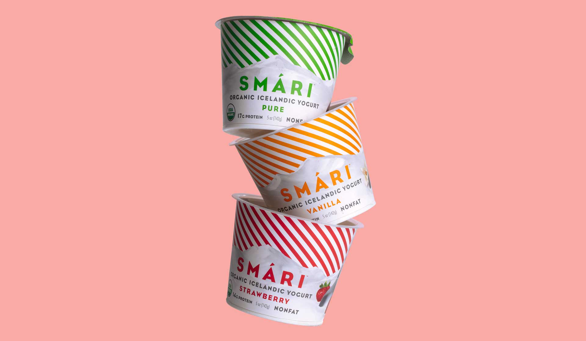
SMARI
A new vision for the brave yogurt of Iceland
Packaging and identity for an utterly delicious yogurt.
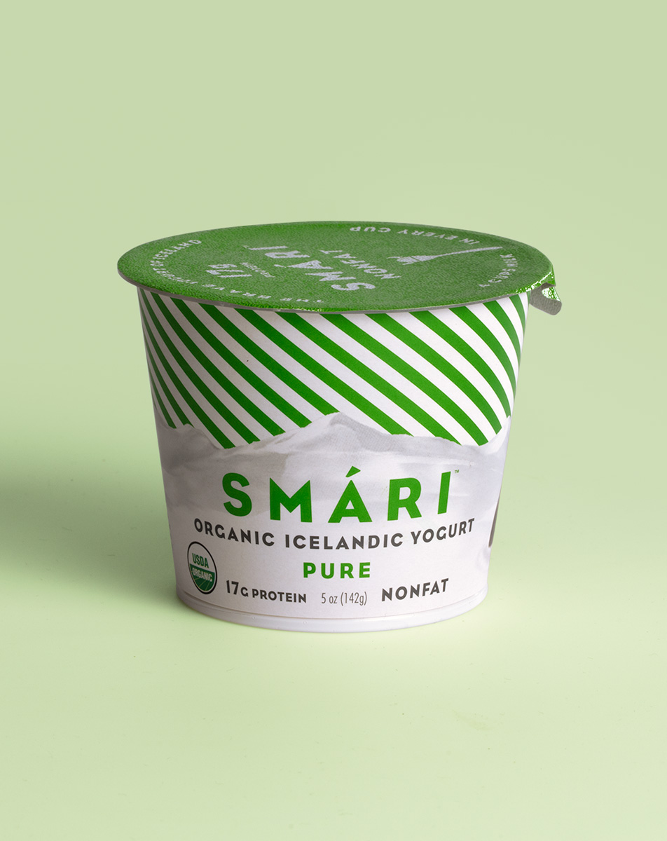
Mountains of flavor.
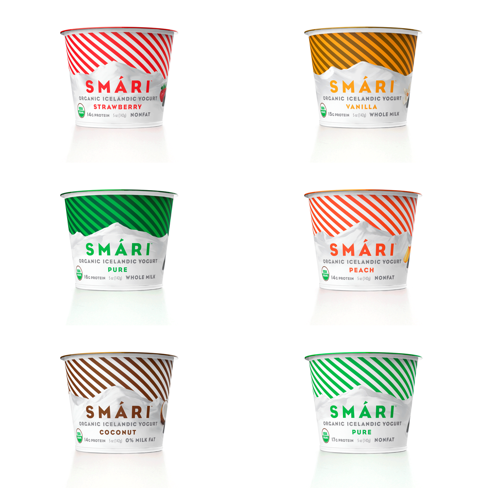
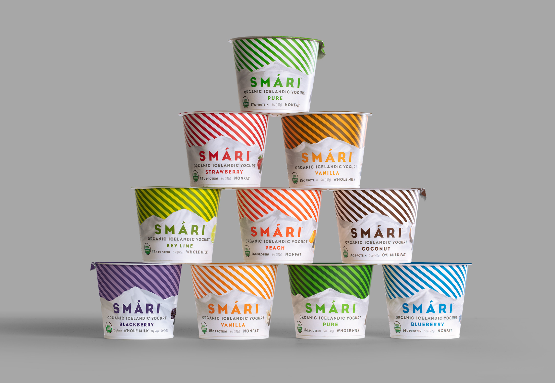
Vibrant stripes are a colorful interpretation of the northern lights. Snow-covered mountains become mounds of delicious yogurt as you turn the cup.
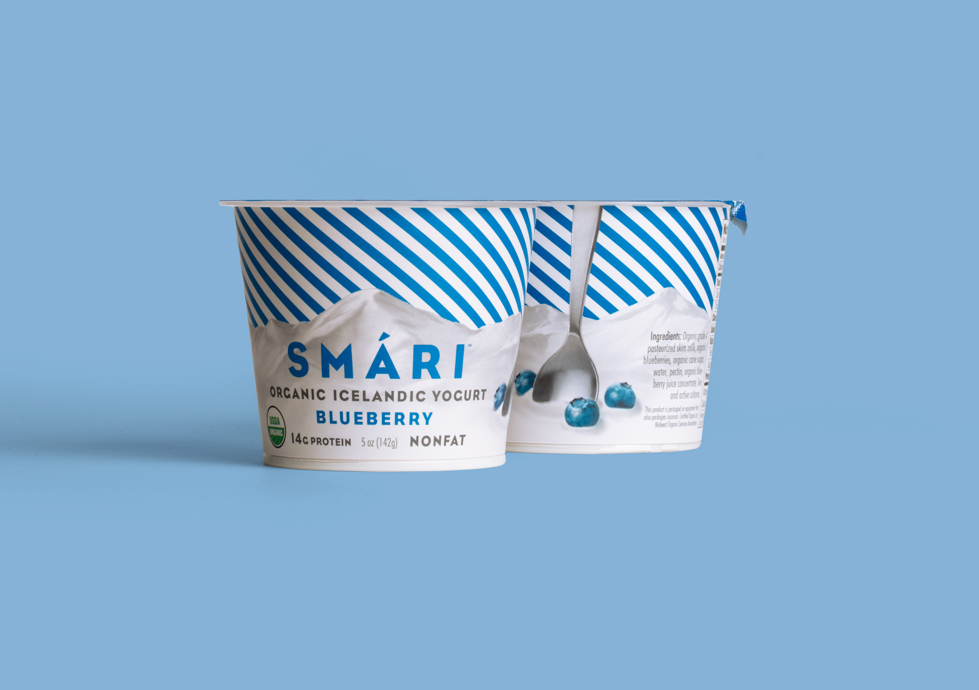
Viking strong.
Iceland has a deep connection to viking culture. We used this spoon to communicate the brands heritage, playfulness and protein power.

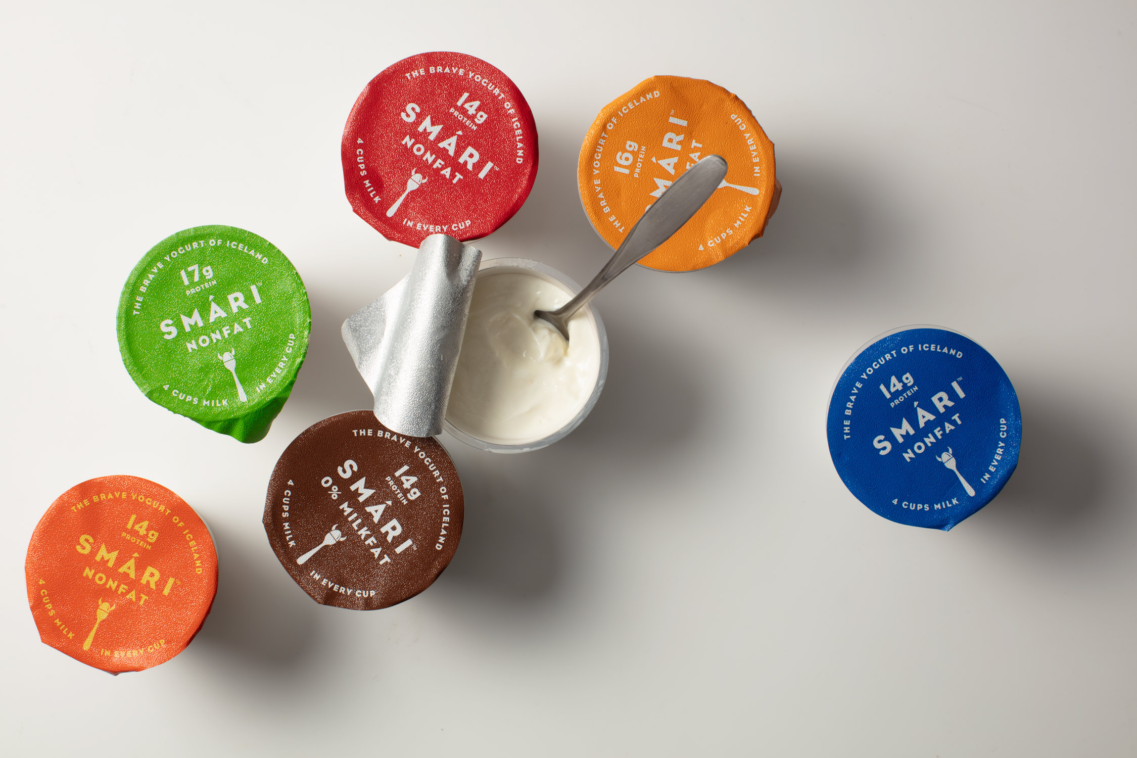
Just like candy.
Although it doesn't have a lot of sugar, the quality ingredients make Smari taste just as indulgent as sweets. In fact, the attention-grabbing colored stripes were inspired by Icelandic candy.
It's what's inside.
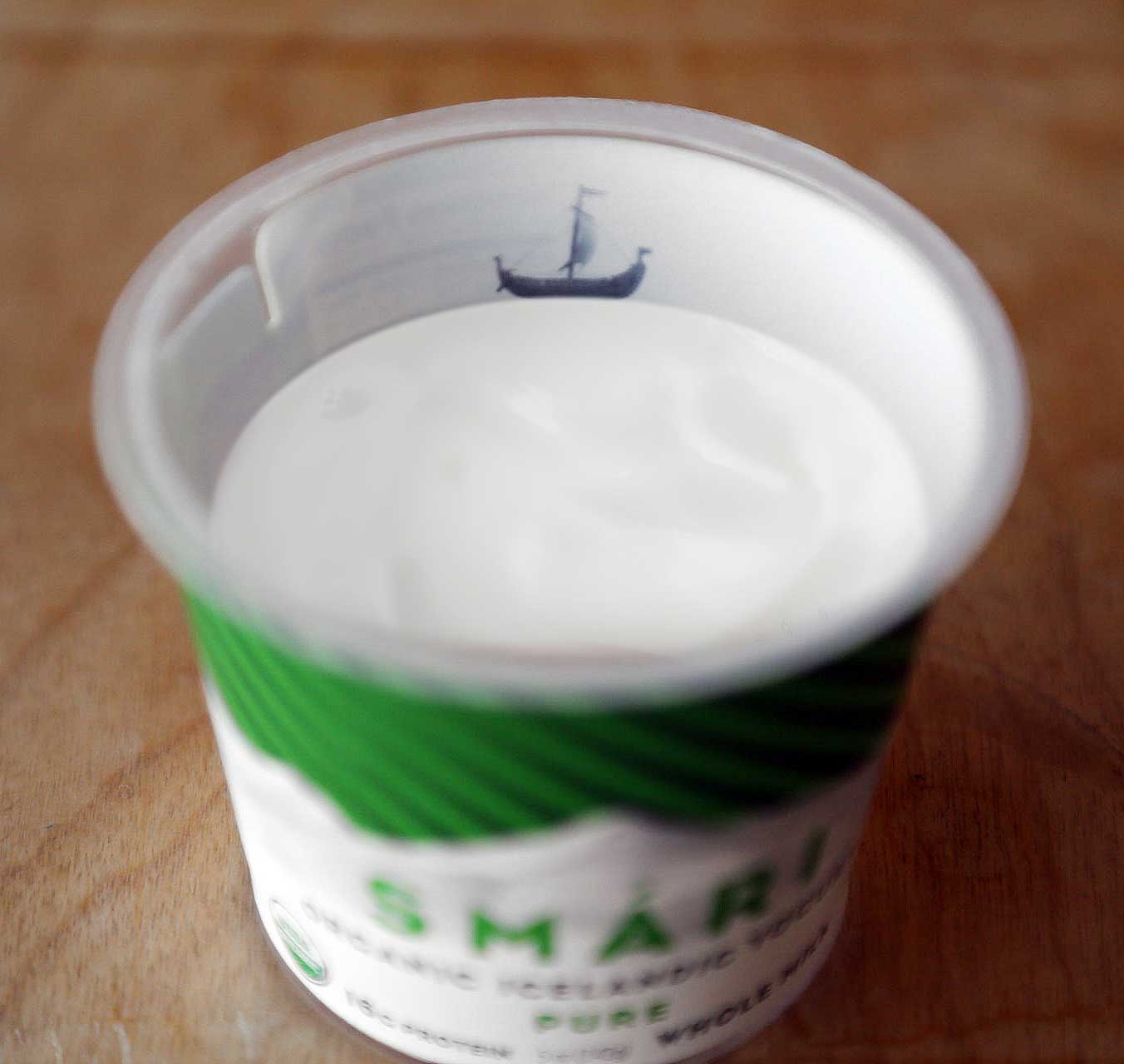
When the lid is pulled off, a viking ship sits atop the creamy yogurt, revealing copy as it's consumed.
"The packaging really captured the essence of both Iceland and yogurt in a delicious and tempting way. SLATE was a fantastic, collaborative partner "
- SMARI ADDMUSSON, CEO & FOUNDER

CAPABILITIES
Packaging
Identity
ADDITIONAL CREDITS
Advertising: Grand Advertising
Illustration: Paul Davis
AWARDS
Communication Arts Award
FEATURED
The Dieline
It's nice that