
DERMSTORE
Rebranding the best kept secret in skincare.
We helped dermstore focus on who they are at their core – a platform for skintelligence.
It starts with "why".
We worked with Dermstore to develop the strategic platform driving the new brand identity: To empower people to bravely explore the world of skincare.
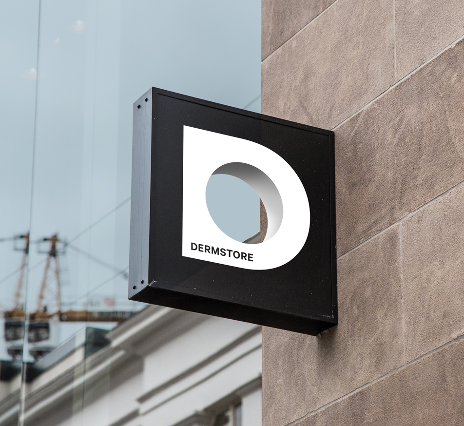
Look through to discover.
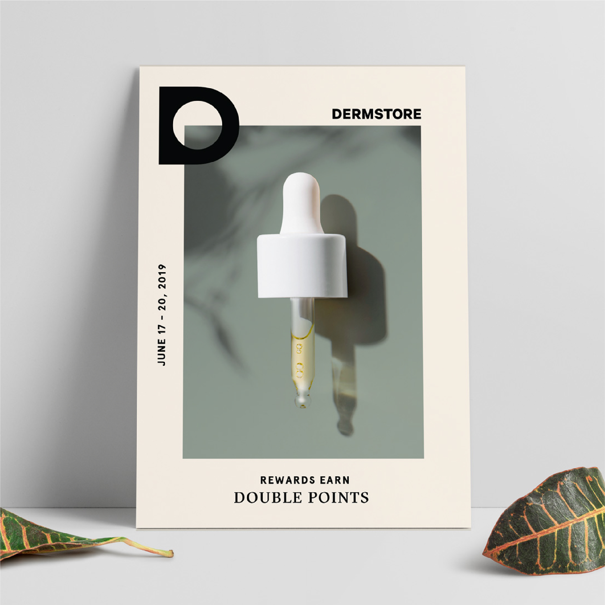
The D-mark is a symbol for exploration and analysis. It was inspired by a dermatologist’s magnifying glass and a metaphorical "hub" for consumers on their skincare journey.
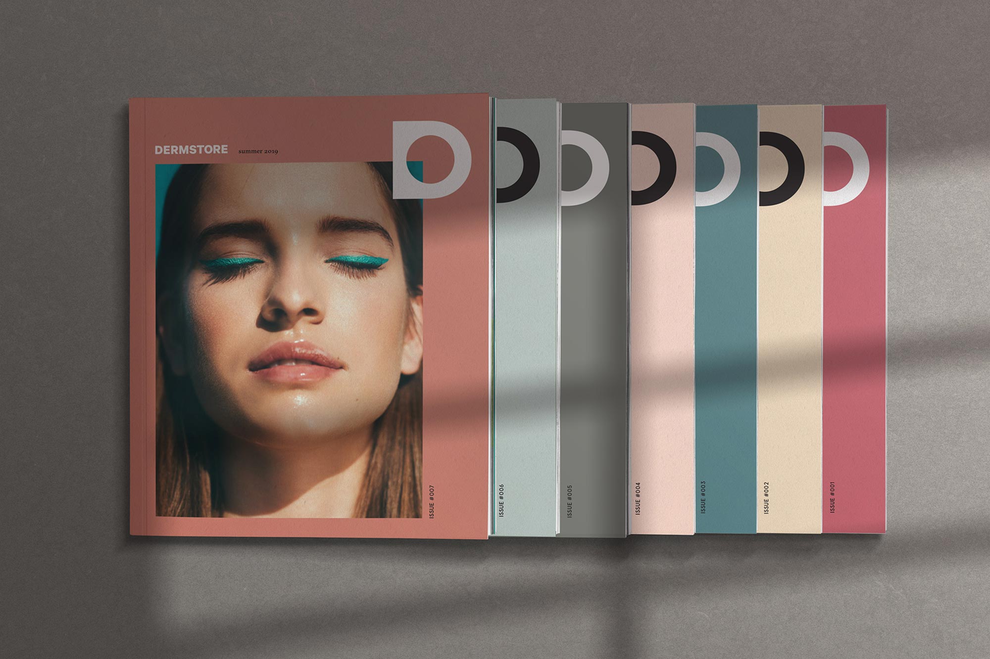
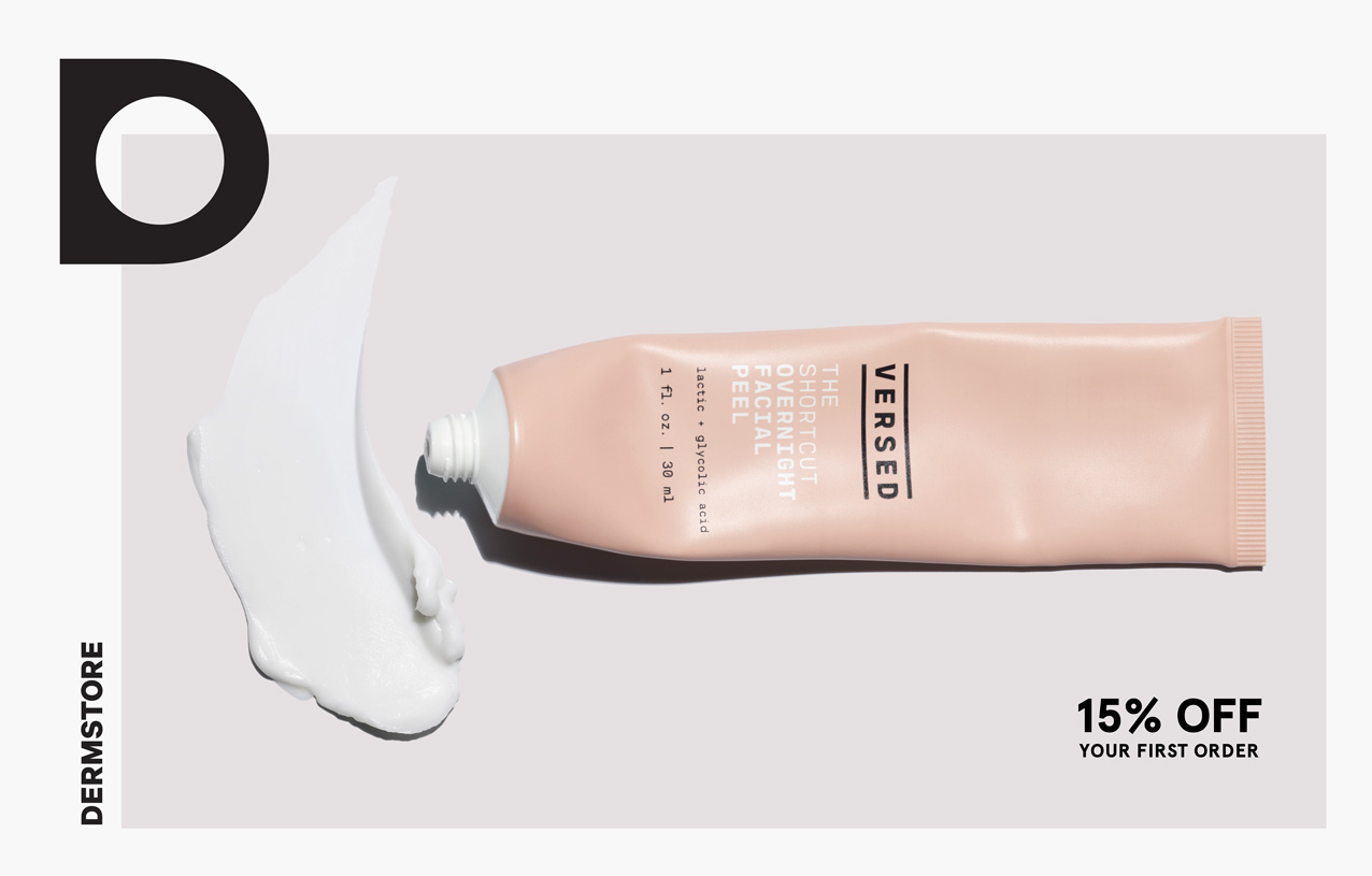
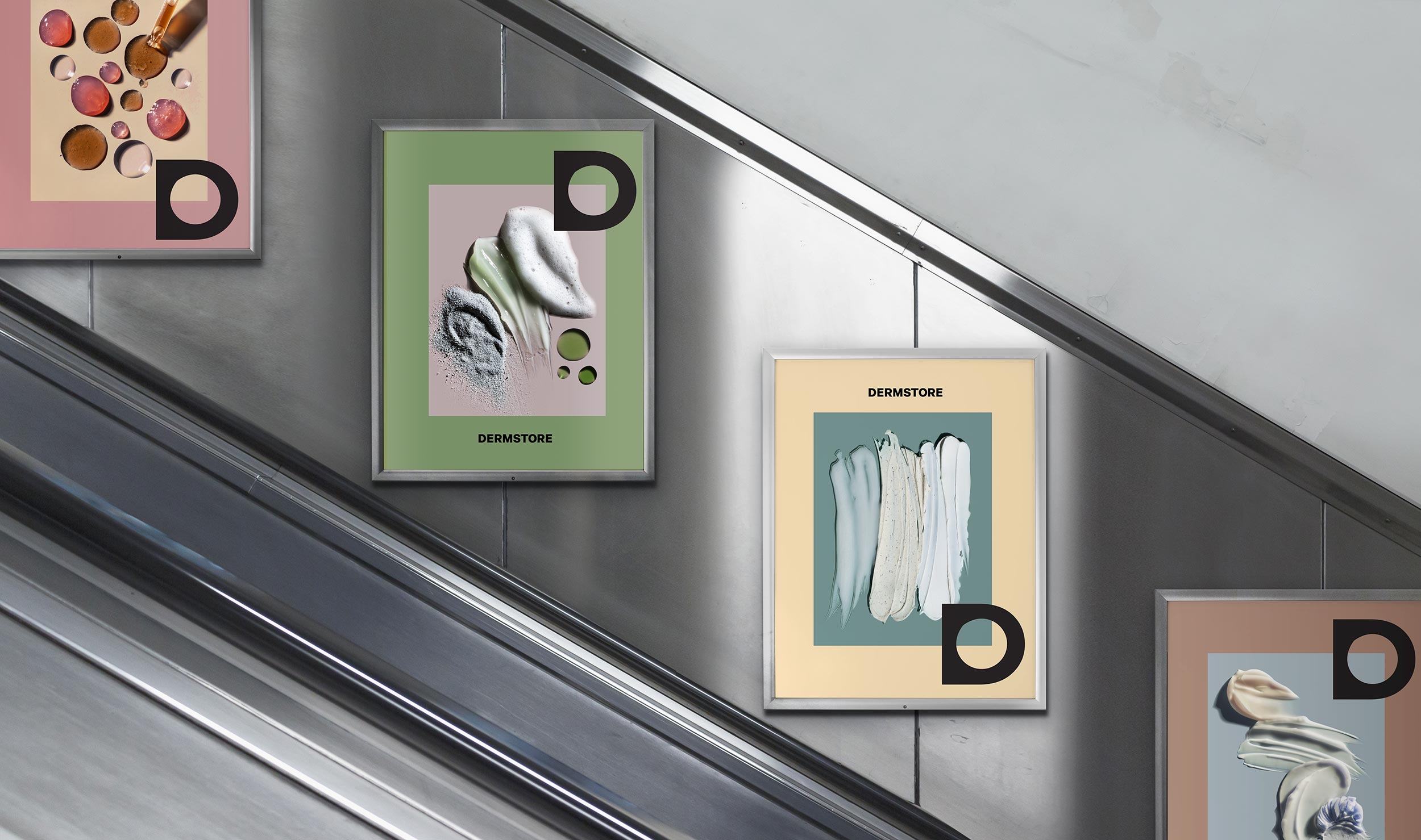
Product as art.
The design language and framing motif both elevates and connects the diverse products to the unified brand ecosystem. We wanted the brand to feel more like a curator than an e-tailer.
Web makeover.
Sometimes a teardown isn't feasible or even necessary. We worked with Dermstore to retrofit what they had, and give their existing site a smart new look.
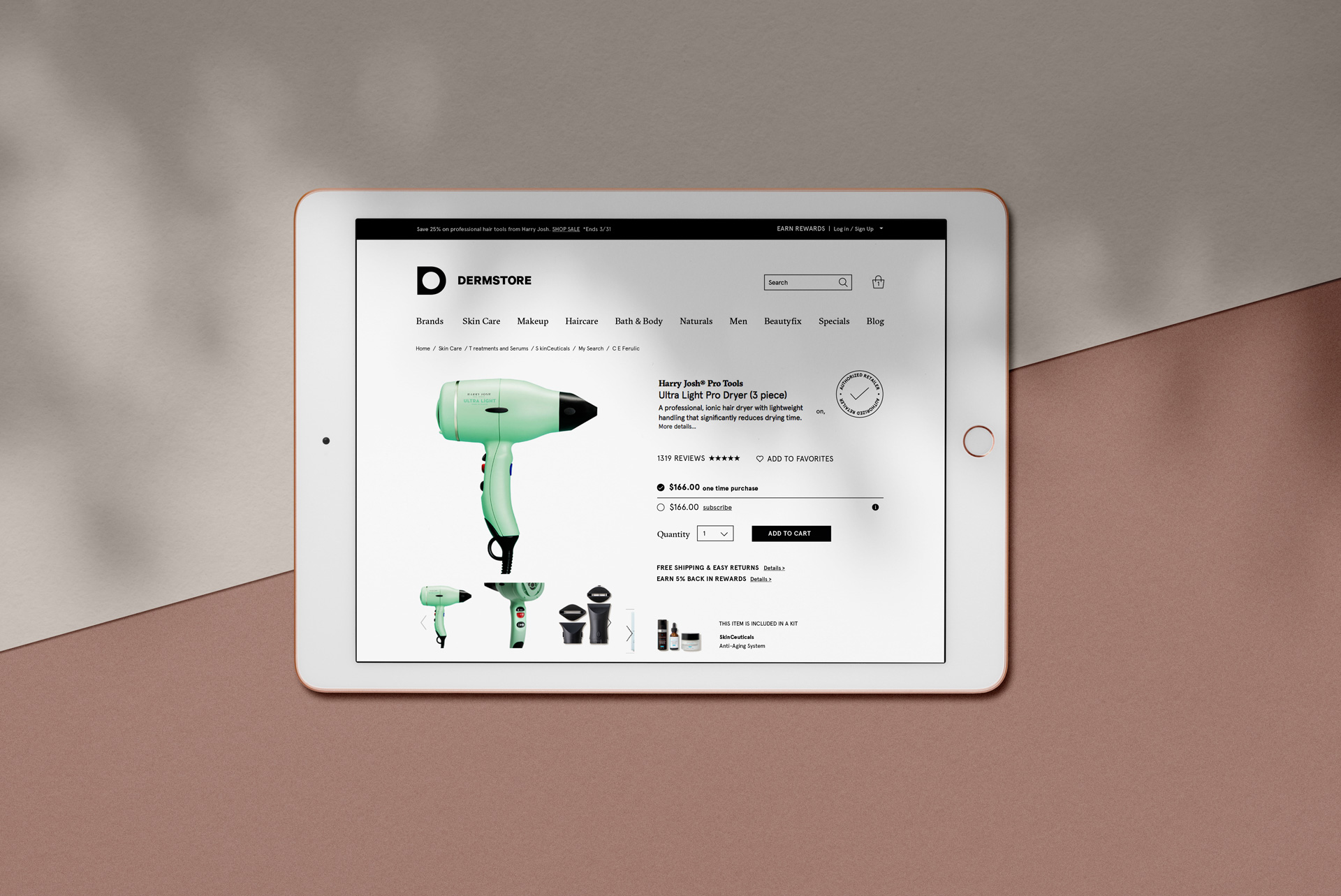

Elevating the experience.
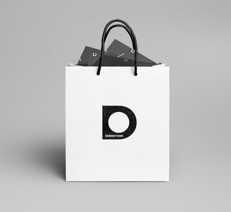
A simple white package opens to an indulgent black interior – elegantly presenting a diverse range of skincare products.
CAPABILITIES
Strategy
Branding
Packaging
Copywriting
Collateral
Signage
ADDITIONAL CREDITS
Close-up product photography:
Irina Markovici
AWARDS
Communication Arts Award
Graphis 2020 Silver
FEATURED
Mindsparkle Magazine
Graphis 2021 Annual
Communication Arts 61
Brand New Under Consideration